Analyze a Trend Report
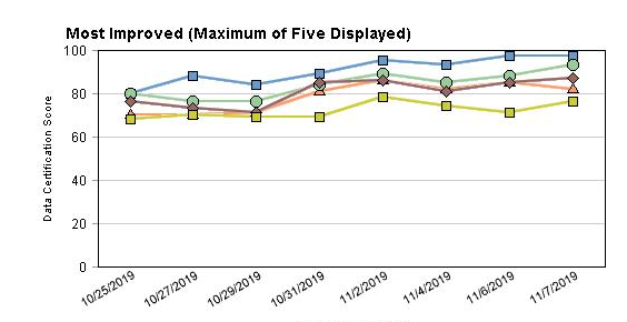
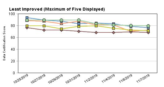
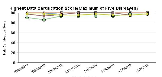
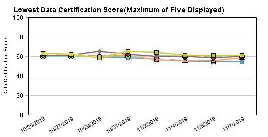
At the top of the report are 4 graphs, each with a maximum of five schools shown. Ove the time range selected for the trend report, they indicate:
- Most Improved Score
- Least Improved Score
- Highest Score
- Lowest Score
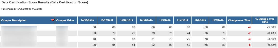
At the bottom of the report is the raw data for the trend reporting period.
Campus Description - School Name
Campus Value - School IRN number
Date Range - based on the date range selected, each date column represents a point in time, evenly distributed based on the range selected
Change Over Time - a value that represents how the score changed from the first date to the last date. Negative values indicate that the score went down.
% Change Over Time - also representing change over the time range, expressed as a percentage
, multiple selections available,